Galileo Learning
ART DIRECTION & BRAND KIT
As the Senior Graphic Designer at the Galileo Learning, I oversaw and designed all visual touchpoints including print, digital, video, photo and website content. I led a small team of designers and collaborated to visually guide Galileo’s video production and curriculum teams.
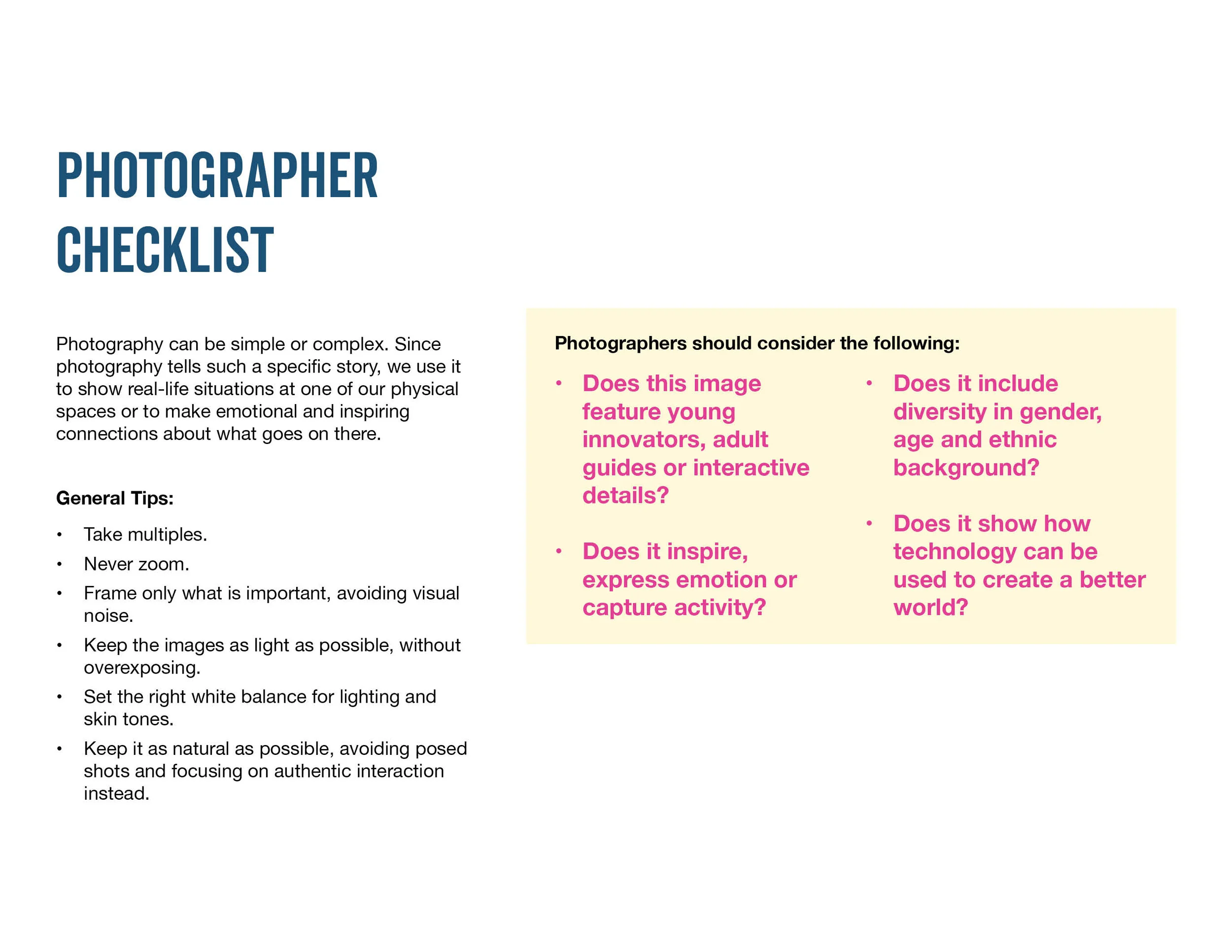
Galileo was in the midst of restructuring their marketing initiatives, where rebranding was a top necessity. I was responsible for analyzing the old Brand Standards that were set in 2002 and determining the art direction for Galileo’s updated look and feel nearly 20 years later. I introduced fresh new assets—reenergizing the color palette, iconography, website design/UX flow, email templates, campaign directions, typography, patterns, and Galileo’s key messaging.
Art direction for Galileo’s 2021 summer camp launch announcement. I conceptualized the look and feel, collaborated with the Camp Director teams to storyboard a visual structure for the script, designed the title cards and graphic assets, and managed the in-house video production team for editing and post-production.
Art direction with new brand guidelines with printed collateral in use—2020 Camp Galileo programs brochure and STEAM Handbook (this book is published and you can buy it on Amazon). I oversaw, designed and collaborated with design agencies to produce these two major printed pieces for Galileo’s 2020 camp launch.
Website Art Direction
For 30 years, Galileo was solely a seasonal, 3-month summer camp business. The pandemic opened opportunities for Galileo to expand into a year-round, global business by introducing online products—Galileo Online housed virtual break camps, at home classes, and membership subscriptions. I collaborated with cross-functional teams to develop the product branding, then implement UX flow on the website. I lead a web design team to art direct Galileo’s vision, and collaborated with them on best UX/UI and other technical practices. Here are responsive wireframes I created for Galileo’s products and lead gen strategies.
Camp Galileo landing page—desktop and mobile view. This landing page broke down and highlighted the main details parents were searching for before enrolling their kids in camp. That consisted of directing users to age groups, and camp theme detail pages, along with testimonials and camp facts that hyperlinked to important logistic information.
Innovator’s Club landing page—desktop and mobile view. This landing page was one of the new online products for Galileo Online. Innovator’s Club was Galileo’s first membership product. Kids were able to pick a class at specific times. As we highlighted the programs by age group, we also implemented an interactive calendar schedule, where users were able to filter by age/time zone. Users were able to enroll directly from the calendar.
Break Camps Class landing page—desktop and mobile view. This is an example of an individual class landing page from the previous filter page. The goal was to preview the class and offer quick enrollment options above the fold, and then highlight more content details below. Since there were so many content details pertaining to the class, rather than have content stack and create a super long page, I sectioned information into a horizontal module where the user could toggle between categories. This also included an interactive calendar that previewed the class schedule with the option to enroll from there.


